.png)
Good Dogma Obedience Training
About the Brand
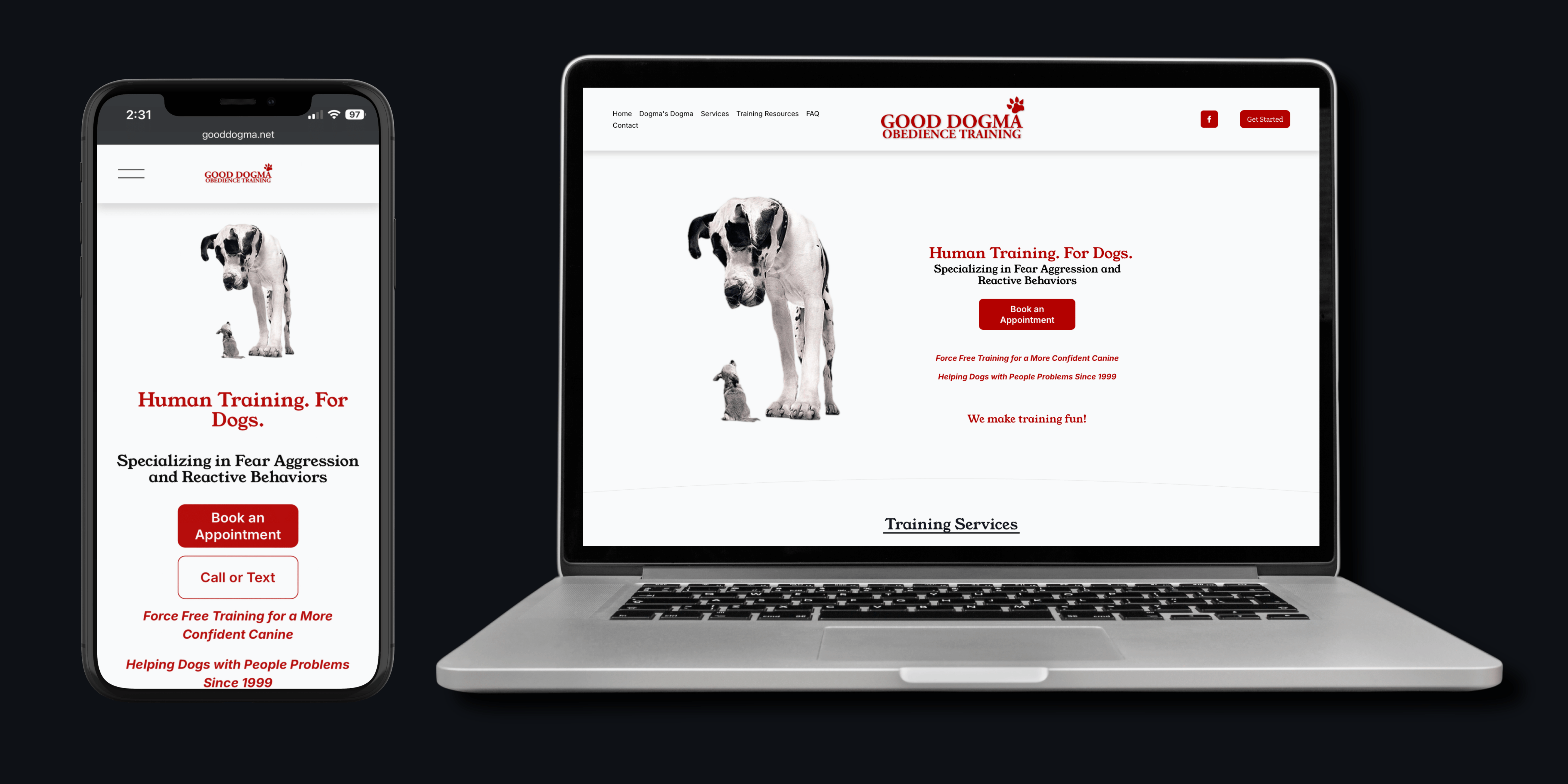
Good Dogma Obedience Training has been working with dogs and their owners on the Central Coast since the late 1990s. Lisa founded it after starting out as a veterinary technician, and she and Vicki now run force-free training focused on the hard cases, leash reactivity, fear-based aggression, and the behaviors that make owners dread walking their own dog.
The expertise was never in question. Between them there's AKC certification, decades of shelter and rescue work, and programs built inside juvenile services and the California Men's Colony. What the business didn't have was a website that reflected any of it. The old site had grown cluttered over the years, with navigation that didn't follow any clear logic and no obvious way for a visitor to take the next step.
Goal
PyreBrand rebuilt the site from the structure up. Navigation was consolidated, pages were reorganized around how someone actually decides to hire a trainer, and the homepage was rewritten to lead with the specialty rather than general obedience.
Clear calls to action, booking, calling, and texting, now appear at every point where a visitor might be ready to act. For a service where most inquiries come from someone standing in their yard frustrated with their dog, that path has to be short
See our work
Contractors who were invisible online. Here's what changed.

Let's work together
If contractors in your service area are searching for your trade and not finding you, those are jobs going to your competitor every single day. Let's build the local presence that changes that.